Styling your Space ….
There is nothing wrong with a pair of stilettos .. To make an impression!!! ..
A strange title… But, I do a great deal of work in an area where homes are bought and sold within a five year cycle due to the local music school, Wells Cathedral School. Wells is the smallest city in the United Kingdom and attracts pupils from all over the country and world, so properties are purchased as second homes by parents that come to stay near their children for small periods during their school terms. Some of these families rent out their second homes for period of time like Christmas and in the summer holiday periods. So it is important to style these homes to suit the owner’s purposes without over styling so that they can be used as short term lets and hold their value for resale at the end of the child’s schooling. The properties need to be simply styled with a warmth that does not overwhelm the space.. And allows anyone to walk in and feel at home.
Five years’ time frame in the interior design business is a big demographic… Let’s face it we would all like to change our interiors to suit the moment … The month, the season the vibe… Interior Design is big business, colours come and go and so do styles and designs… So in styling these properties you have to be a little more focused on what will work now, next year and in five years’ time without looking dated, the furniture has to be durable the colours have to be workable for all purposes…
I am going to base my top tips on a house I did up for a client, a few years ago, which has just been put back on the market by the Estate Agent that sold it to the client, needless to say it sold straight away again .. Good News ..
Keep it Simple if it is for re-sale .. Vivienne Westwood wall paper & Nina Cambell fabric ..
My original brief was to make it a home in and make it saleable …
1. My client, most important things in their brief, big beds, comfy sofas and a large glass coffee table.
The bedrooms were of a reasonable size but the large bespoke designer beds that they liked were out of the question as the room space would not allow it… So expensive bed bases and mattresses were purchased, and valences used to cover the mattress bases, I am not a lover of valences but you can find some simple clean lines on the market and the client liked them, they can also be laundered if using the beds for rental periods.
So we can’t have luxury designer supersize beds … Next best thing.. Big bespoke headboards they don’t take up space as they are attached to the wall but they make a big statement. My client wanted fabric headboards. Templates were created and the headboards were cut out of MDF, covered with foam overlaid with fabric and buttoned. The headboards were complimented with matching cushions all giving the feeling of luxury.
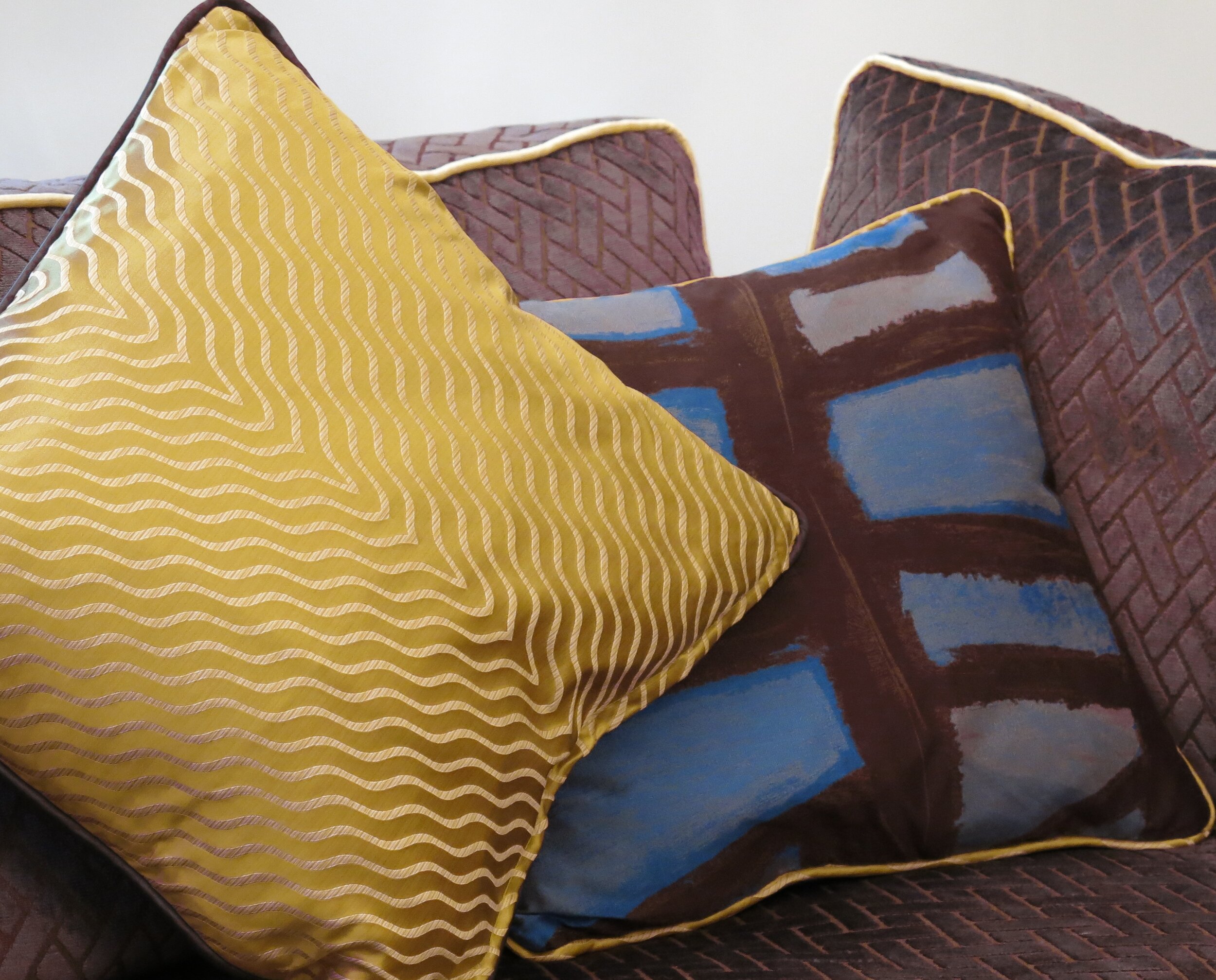
Cushions, great tip, they change the feel of a room, with the use of colours and textures. And best of all, if they don’t last the test of time they can be easily replaced and updated at minimal cost.
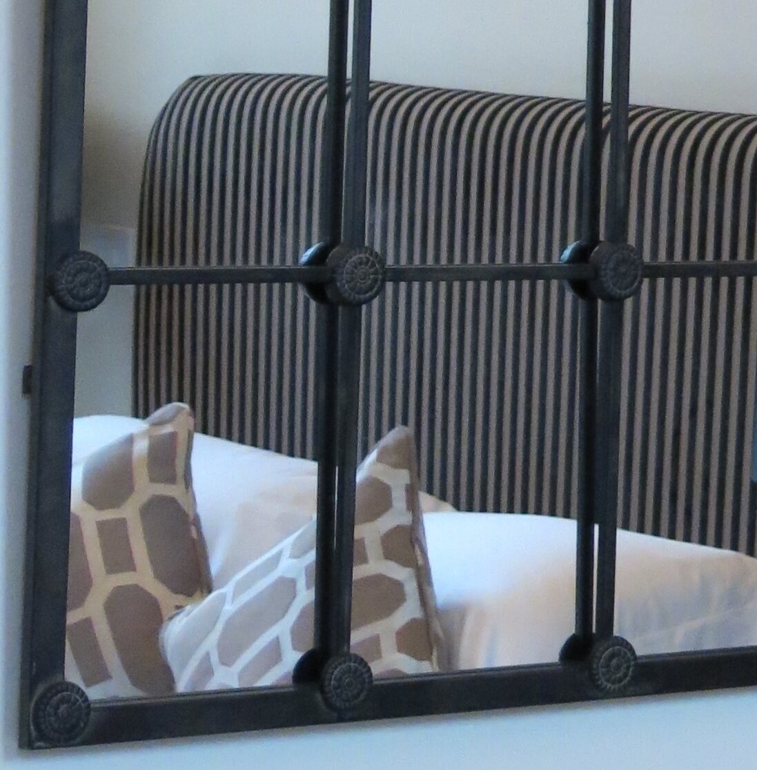
Always good to have an occasional chair … And a simple ticking fabric..
2. The large sofas were also bespoke made as the client wanted to take them, when they sold the house. These fabulous upholstered creatures were in furnished in luxury hard wearing neutral colours with my quirk to make them stand out individually in the room, the cushion seats were corded in acid yellow … I like a design quirk, in this case it just gave an extra dimension! Cushions, as I have stated easily make a statement, a flush of colour and lux and they can be changed to update a design at a later stage, so complimentary fabrics were chosen for the cushions and piped in coordinating colours.
Large sofa’s matched with large glass coffee table & scatter cushions..
3. The enormous glass coffee table was commissioned, there are many companies that can do this type of design to your personal brief. I like a second shelf under the table so you can have a collection of magazines, books and papers.
4. The relatively basic kitchen which was constructed and assembled by the builder who undertook the project and was selling the property, so the brief here was to make something more suiting to the overall look of the property and bring it alive. Simple styling here, let’s face it a kitchen is an evocative space so lends itself to an assortment of styles. This kitchen had limited work space so a kitchen maid was an ideal solution to hang the sauce pans and the pots. The windows were not as such over looked, but there is a busy church all next door, so large cast iron pots were put in the window opening, these did not affect the light coming into the room but forced the eye to focus within the space of the room and gave a further privacy value. I filled them up with cricket balls; why? Because it took my fancy at the time…
Table & chairs all bought from a reclamation company & refurbished .. with velvet hard wearing fabric for the seats..
5. We purchased a large antique wooden table and chairs off the internet, the seats were upholstered rich blue hard wearing fabric. Opposite the table under the most wonderful stain glass window we placed a large wooden dresser, for further storage… These items were tied together with a simple hexagonal rug set between the furniture in complimentary hues. And as ever some designer candelabra’s were purchased… For the fun evenings drinking wine…
6. Another big but essential item was curtains and blinds, yes they are a cost but they are the envelope to the design, they picture frame not only the window but the rooms and add warmth, they are the wrapping to the rooms.
7. The electric flame fireplace put in to my clients property by the builder, was okay … But a bit mediocre and well … small … So to make it look more elegant we put an antique wooden fire surround on the wall around the fireplace, obviously modern fireplaces and antique fireplaces do not have the same measurements and dimensions… So we filled in the blanks with a warm marble that matched in with the rooms colour palate, remember whoever is going to purchase this house in five years’ time will need to put their own design and style so keep the colour scheme classy and simple..
8. The marble theme was taken through into the kitchen and used as a worktop on the wooden dresser and the off cuts used as table placement boards on the wooden table .. So the effect was to create cohesion between the rooms…
9. Back to my mirror obsession, as the house is going to be resold in the next five years the interior design has to accommodate that brief, so the room should not be too ‘personalised’. It is a mistake to put to many personal items in a home such as paintings and pictures, they can devalue an easy re-sale. With mirrors, my great friends, they make a property look larger and the reflections highlight the aspects of the room … As you can see the one in the kitchen is huge…
The staircase in this property was.. Well mean.. So we put an enormous wall mounted flat mirror on one side of the wall to widen the narrow staircase and dropped a slim but very large light down from the high ceiling, which beautifully reflected the light in the mirror, this widened the area.
Make a small space big .. With a big thing .. But it works …
10. The lighting was very much to the liking of the owners, the ceilings downstairs were with relatively low and therefore the chandeliers had to be on a short splay. Upstairs the ceilings were higher and afforded larger length lighting.
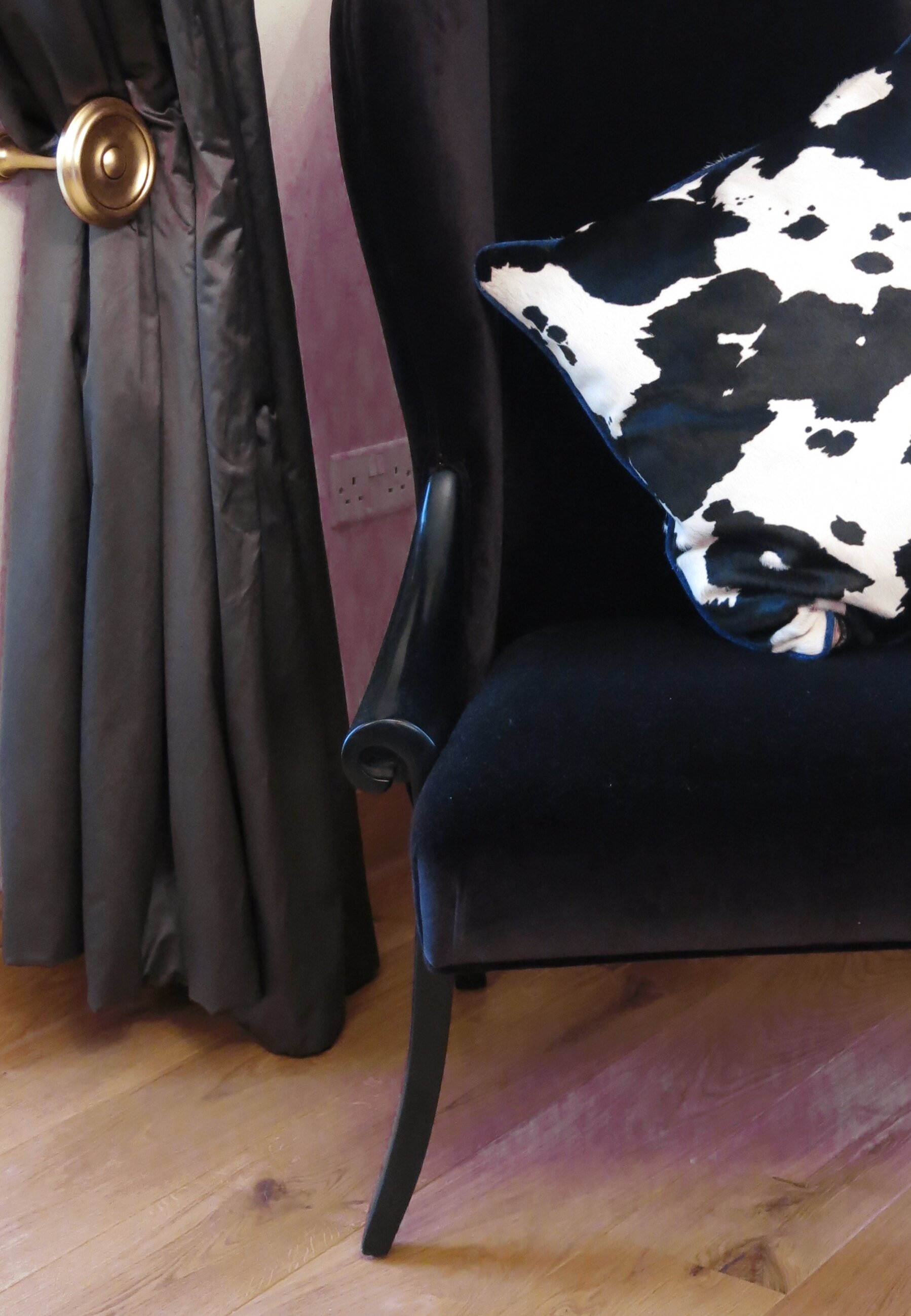
11. Finally the bits and pieces or as my mother friend calls the bells and baubles, could be added, the wife allowed me to put in some more ‘out there’ design features, to be fair her husband was a little more circumspect, but was pleased with the results. We had designed and upholstered, some funky chairs in mock cow skin hide and Greek key styled fabric.. In the hall above one of the chairs we installed a highly polished hall mirror that was made out of an aeroplane wing with a red clock in the hole where the porthole would have been..
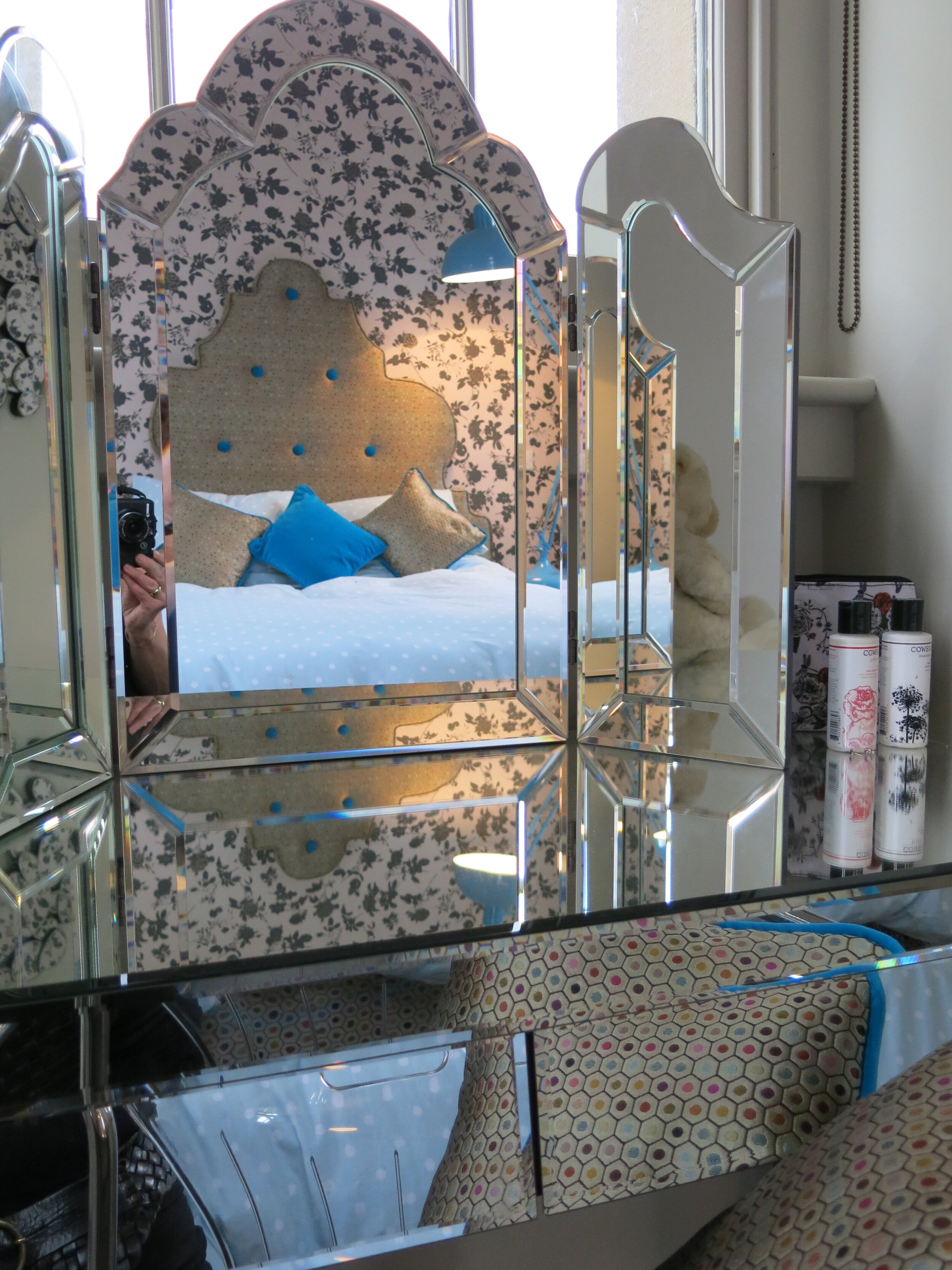
In the hallway we placed a highly polished ebony hall table and in the bedrooms we had bevelled edge mirrored dressing tables all with the intention of bring the rooms to life.
From Kitchen to Hall …
12. And just for a bit of fun .. On some key walls, we put a splash of colour by using some structured wallpaper … Well you have to …. Don’t you!
13. The garden, had to be of the lowest maintenance, so around the terrace was graveled hard standing area with a high walled garden created to one side filled with hard wearing plants…
So what we achieved, is a second home, a part time home, if you like, that is easy for everyone to inhabit and relax in…. ‘Like a Sunday morning’! It is not where your main life is, but it is part of your private life… A home from home for all …. That someone else could step into and feel just as at home … The proof was in the design.. The house was put on the market and under offer straight away ….
Mirrored table ….


